I built my first web home page and made my first contributions to the School of Engineering Journal at UPenn in 1993.
And I’ve built at lot more since then…
Here are some of the things I learned along the way…
I built my first web home page and made my first contributions to the School of Engineering Journal at UPenn in 1993.
And I’ve built at lot more since then…
Here are some of the things I learned along the way…

Many web browsers and even hugo won't display images correctly if their color profile isn't sRGB. Hugo also won't convert properly if the source format is WebP. Here are some solutions.
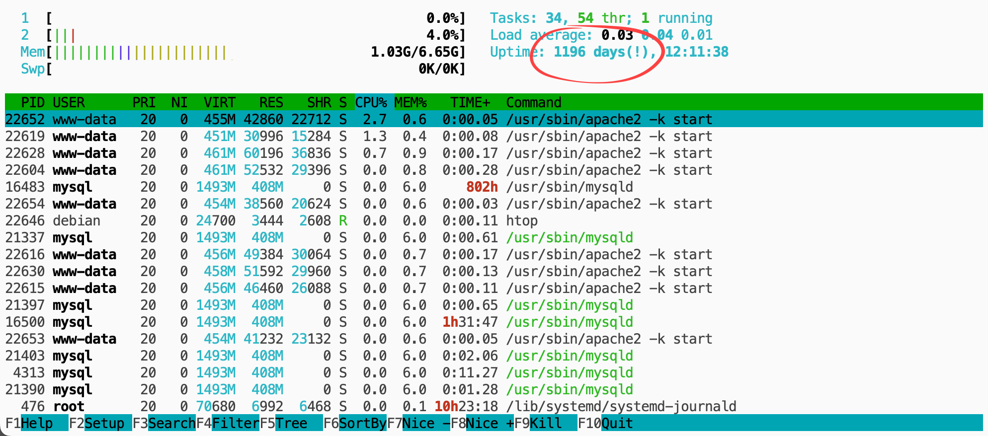
As I sort of dropped the ball on the development of b2evolution CMS after 18 years, I'm left with a quite a few websites running on unmaintained software... Surely, relying on (de facto) outdated server software is a big no-no for anyone working in I.T. Yet, I kept pushing the ball down the road... with no real plan in sight... Maybe I was subconsciously waiting for everything to break down...

From time to time I do a little housekeeping on my blogs. Today I moved some old English posts from my French blog to my English blog. I'm not sure if it even matters, but it gives me some satisfaction to tidy things up. I do it as a distraction…...
I've just uploaded the evo-sublime theme for Sublime Text on GitHub . It is a dark text on light background theme, with vivid highlights. This is the theme I use to work on b2evolution. Installation You need to copy the color scheme into the Sublime…

I think it was about time I re-skinned this site! Since my last post pledging to get rid of the ugliness, I feel I've made some significant progress on b2evolution.net (especially the home page) but my personal site(s) was really starting to hurt my…...

2014. Time to wake up, eh? First off, why have I been blogging so little in the last couple of years? Guess it's a combination of: Too much work Having a real life (which I might not have had a few years back...) Google did a great job at scaring me of…...

For some reason, nobody seems to acknowledge there is a bug with Codeflush() in PHP 5.4. In any previous version of PHP, you could just do: PHPflush(); and the PHP output buffer would be sent to Apache which would in turn send it to your web browser.…...

Live HTTP headers is a FireFox extension that lets you look at all HTTP headers for all requests issued by the browser. Now updated for Firefox 1.5.
You may have noticed that PHP scripts that echo a lot of content appear to be running with poor performance... Well, the operative word here is "appear". It is a common misconception that "echo is the slowest PHP command"! The problem is actually…...
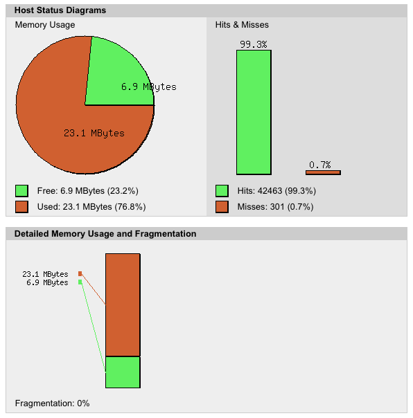
The APC cache can significantly improve your PHP script performance, just by installing it, whoch basically takes 5 minutes! Here's what I did on my Debian Lenny box... First you may want to have a reference benchmark to see if it actually improves:…...